Marketing
Color in Graphic Design: How to Choose a Palette for Your Brand
Trying to choose colors for your business? We walk you through the process step by step and explain how color psychology works in marketing.
Color in Graphic Design: How to Choose a Palette for Your Brand
Table of contents
- Why does your brand need a color palette?
- Where will you use your company's color palette?
- Color psychology
- How to choose your brand colors?
- Color in design - summary
Color in marketing is a powerful tool that can significantly shape how a brand is perceived and what emotions it stirs in consumers. Trying to choose colors for your business? We walk you through the process step by step and explain how color psychology works in marketing.
Why does your brand need a color palette?
Color is one of the elements that make up a consistent brand image. That's exactly why choosing the right palette should be well thought out and matched to your brand's values, personality, and goals.

Where will you use your company's color palette?
- packaging design - it's worth keeping colors consistent across product labels, which makes a brand more recognizable.
- websites - your company's website is its virtual storefront. It's worth investing in an attractive graphic design that uses your primary and complementary colors, worked into interface elements, buttons, headings, and the footer.
- social media - use your color scheme to build graphic templates for posts and reels. Keep in mind that social media is often where an audience encounters a company for the first time, and an aesthetically pleasing Instagram feed encourages people to follow a brand's profile.
- email marketing - newsletters are also worth designing around a set color scheme, to build brand awareness. You can create message templates that stay consistent with your visual identity.
- company merchandise and marketing materials - you'll use your color palette not just online, but also on letterhead, in folders, portfolios, calendars, notebooks, business cards, brochures, flyers, and banners. This keeps your company recognizable across a wide range of communication channels.
Wherever your brand appears, it's worth sticking consistently to your color palette. This helps build recognition and trust among customers.
Color psychology
Colors evoke emotions, and emotions carry enormous weight in marketing. They influence purchasing decisions - not just once. Combined with the right messaging and values, they can encourage a customer to buy again or use a service again. Wondering what colors actually mean in marketing? As in every area of life, colors in marketing carry universal meanings and associations.
Black
Black is a color of elegance, but also mystery. It's often used by brands aiming for an air of luxury. Black is common among premium fashion and cosmetics brands, as well as in the automotive industry. It can also symbolize modernity and minimalism.
Red
Red is an energetic color associated with courage and strength. It's often used to grab attention and evoke strong emotions. It's no coincidence that it's used in sales and promotions, to heighten a sense of urgency.
Red is also, however, the color of love. It's strongly associated with romance, warmth, and holidays.
Blue
Blue is a cool color that stands in contrast to the energy and intensity of red. For many people, it likely brings the medical field to mind first. Over the years, blue has also come to dominate the technology, electronics, and finance industries. It's associated with professionalism, security, and order.
Green
The first association is nature, ecology, and plant life. Green is a color of calm, trust, balance, freshness, vitality, and health. It's therefore the most popular choice in industries related to environmental protection, health, and organic products. Green is also, though, the color of money. That's why financial companies, insurers, and banks are drawn to it.
Pink
Pink has traditionally been seen as a color for girls and women. It's associated with softness, care, and sweetness, but also romance. It's most often used by brands offering products and services for women, as well as in the cosmetics and fashion industries. Pink has also become a symbol of breast cancer awareness, so you'll often see it in the branding of foundations and social campaigns.
Yellow
Yellow is considered the most optimistic color. Warmth, sunshine, positive energy, and joy are the associations tied to a yellow palette. Yellow is also often used to grab attention and spark positive emotions. It's a popular choice in the food and restaurant industry, as well as in industries tied to creativity and innovation.

These common color associations stem mainly from psychology and culture, so they can be perceived somewhat differently around the world. Ultimately, how a given color scheme is received also depends on personal preference. Still, it's worth keeping color psychology in mind to strengthen your marketing message and build a recognizable brand.
How to choose your brand colors?
Facing the challenge of putting together a color palette for your business? You're probably asking yourself: Which color attracts customers? Which color looks professional? What matters most is choosing a palette that best reflects your company's profile and fits its character, values, and overall communication strategy.
Here are the steps worth taking to build a consistent color palette for your brand:
Brand analysis
Start with a detailed analysis of your brand. Define its identity, plan out the values you want to communicate, and decide what kind of emotions and reactions you want specific colors to trigger in your customers. Ground this in your company's mission and values.
At this stage, be sure to define your target audience. Your color scheme largely depends on who you'll be communicating with. Will it be expectant mothers shopping for newborn essentials, people looking for innovative digital products, or fans of vegan cuisine?
Remember, a color palette is just one part of how you communicate with your audience. How it's perceived, and what associations it triggers, depend heavily on its colors.
Competitor analysis
Before you start putting together a color palette for your company, take a look at what your competitors are already doing and what the market expects. It's worth examining which colors dominate in your industry and what design trends are currently popular.
Analyze what catches your eye in your competitors' color choices, and which choices you think missed the mark, and why. This will help you avoid copying other people's ideas and make it easier to figure out how to stand out from the competition.
Choosing a primary color and complementary colors
Start by choosing a primary color that best reflects your brand's identity and evokes the emotions you're after. Then choose a few additional colors to be used as accents in graphic designs and marketing materials.
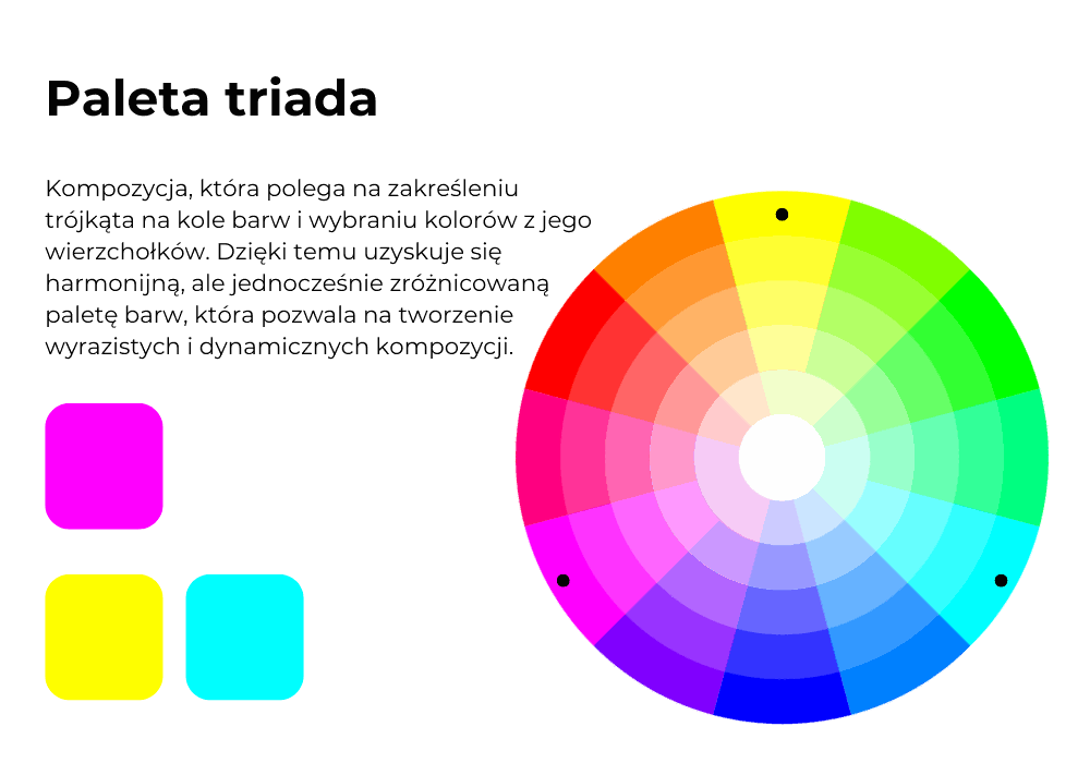
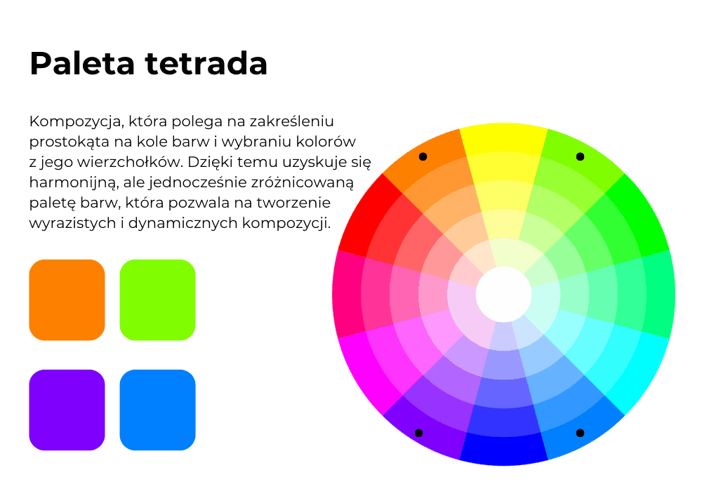
The foundation of building a color palette is understanding color theory and the various relationships between colors that help you put together a harmonious set. An essential tool in this process is the color wheel. It's a graphical representation of colors arranged in a circle, where colors are organized by various relationships. In it, you'll see different shades of red, orange, yellow, green, blue, and purple. Colors are shown here in various forms depending on brightness and saturation.
The color wheel lets you read off different relationships between colors:
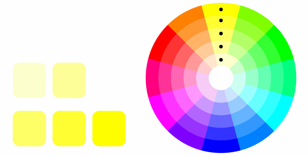
monochromatic - one of the simpler color relationships, since it focuses on a single color and its various degrees of brightness and saturation. For example, if you choose blue as your primary color, a monochromatic relationship might include shades ranging from light sky blue through cornflower blue to deep navy. In a yellow version, it might look like this:
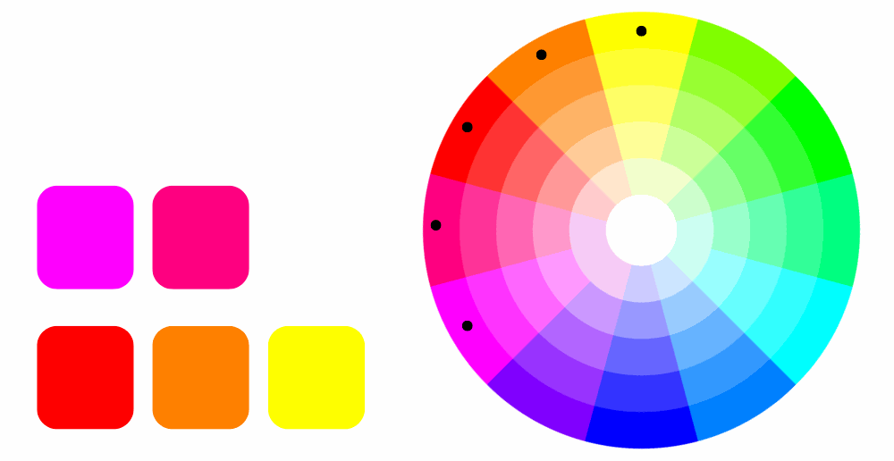
analogous - colors that sit next to each other on the color wheel, such as red, orange, and yellow. These work well for harmonious designs:
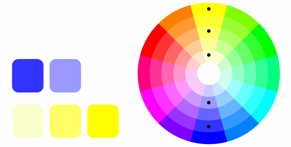
complementary - colors that sit opposite each other on the color wheel, such as red and green, blue and orange, or yellow and purple. Complementary color pairs create a strong contrast that catches the eye:
triads or tetrads - three or four colors spaced evenly around the palette, creating the most varied combinations:
Testing
Finally, create sample designs using your chosen colors and evaluate how they look in practice. Remember to test your colors across different devices and screens. That way, you'll be able to confirm early on that your palette looks the way you expect, both in print and online.
Color in design - summary
Color in marketing isn't just about aesthetics - it's also a strategic tool that can help you succeed and build lasting relationships with customers. Colors trigger specific associations and psychological reactions, which can shape how people perceive product quality, how much they trust a brand, and how ready they are to buy. It's important for colors to be applied consistently across all marketing materials, from your logo and website to packaging and promotional materials.
When choosing a color palette for your business, it's worth drawing on both color theory and the psychology of color. That will make it easier to build harmonious combinations and understand how colors interact with each other and with your audience.
If you need a consistent color palette for your business, or want to refresh your brand's image, let us know. We work with color across a wide range of industries, choosing palettes and creating compelling graphic designs. We'd be happy to create something creative for your business too.