E-commerce
Pop-ups in Online Stores: When Should You Use Them?
Are pop-ups, which grab a user's attention by design, always a good idea? Find out how pop-up windows affect UX and the visibility of an online store, which types of pop-ups are best avoided, and which ones are worth using.
Grabbing a user's attention in an online store is harder today than it has ever been. Customers scroll quickly, compare offers across several tabs, and often make decisions within seconds. That's exactly why online store owners are so fond of pop-ups - windows that pop up on screen to direct the visitor's attention to a specific message.
A pop-up can be an effective sales tool or an annoying obstacle. A well-designed one helps a user find a promotion, take advantage of a discount, sign up for a newsletter, or come back to an abandoned cart. A poorly designed one blocks content, gets in the way of shopping, and makes the customer leave the site faster than they can even learn what's on offer. So is it worth using pop-up windows? Yes, but only when they have a clear purpose, are matched to user behavior, and don't disrupt the shopping experience. In this article, we explain what pop-ups are, when it makes sense to use them, which types work well in e-commerce, and how they affect a store's UX and SEO.
Table of contents
- What are pop-up windows?
- What are pop-ups used for?
- Types of pop-ups
- Pop-ups and online store SEO - what does Google recommend?
- How to use pop-ups without scaring customers away
- Put user experience first
What are pop-up windows?
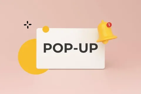
A pop-up, sometimes also written "popup" or "pop up," is a message in the form of a banner or other graphic element that appears while a website is being displayed. All three spellings literally mean "to pop up" or "to appear," which precisely captures the nature of this kind of message.
Pop-ups can take many different forms and carry all sorts of content. They announce promotions or special offers, and they also boost the visibility of subscription forms and event invitations. Despite this variety, pop-ups share one common trait - they're designed to effectively grab the user's attention. They often appear a few seconds after the rest of the page content has loaded, which lets them push their way to the front.
Pop-ups can act as a genuinely effective marketing tool, one that promotes an offer, encourages purchases, and helps build a base of loyal customers. That said, pop-ups remain one of the most controversial topics when it comes to UX, or user experience.
Why don't users like pop-up windows? They're often seen as irritating, especially when they appear too frequently or, worse, block access to a page's content. That's when pop-up blockers become popular. So when you're planning to add a pop-up to your online store, it's worth pinning down exactly what purpose it's meant to serve - and thinking through how buyers might react to it.
What are pop-ups used for?
A well-designed pop-up can bring plenty of benefits, both to the store owner and to users. Let's take a look at the types of pop-up windows based on what they're meant to achieve in an online store.
Here's what pop-ups can display:
- Information about promotions, discounts, and sales. Attractive prices remain one of the most effective ways to draw in customers. If your store offers a discount code or seasonal price cuts, make it easy for customers to find these special offers.
- A free-shipping message. Free delivery or free returns often end up being the deciding factor in a purchase decision. If you go with this kind of pop-up, it's worth adding information about the order value needed to qualify for free shipping.
- A personalized offer. AI-based tools let you gather more data about a given user's shopping preferences or browsing history. Based on that, you can display a pop-up with personalized product recommendations.
- A limited-time offer. The principle of limited availability can significantly boost sales. That said, use messages like "Hurry!", "Only a few left," or "Don't wait!" with restraint, so you don't put excessive pressure on users.
- New products. An extra pop-up promoting a new collection can effectively boost sales and increase time spent on the site.
- A contact form. Simplifying communication as much as possible and collecting feedback can improve customer service. You can offer a window with the key fields to fill in - first and last name, email, phone number (optional), a message field, and a CTA to submit the form.
- Newsletter sign-ups. If you go with this kind of pop-up, tell the user what they'll gain by subscribing to your newsletter. Offer a simple, clear form that lets you build a mailing list and stay in regular contact with customers.
- A window for leaving feedback. Collecting ratings matters because processes and customer service need constant optimization. This type of pop-up should be a subtle nudge rather than a hard sell. Aim for friendly, low-key messages that don't feel too pushy.
- Links to social media. A pop-up can encourage people to join your online community - again, focus on the value you can offer your audience and why it's worth following you.
- Sign-ups for upcoming events. These messages can apply to both offline events and things like online webinars. They may include a countdown timer to a specific event and a link to the registration page.
- A reminder about items left in the cart. This kind of pop-up is a way to bring the user back and reduce your cart abandonment rate.
Of course, beyond advertising and prompting users to take a specific action, pop-up windows can also be tied to legal requirements. On many sites, pop-ups appear to inform visitors about cookie use, GDPR notices, personal data processing rules, or to confirm the user is of legal age.
Types of pop-ups
Not every pop-up works the same way. The differences come down to appearance, placement, and timing. Which form you choose should depend on the purpose of the message and on how much you want to intrude on the user experience.
Overlay pop-ups
One of the most common types of windows - they "pop up" as a graphic banner in a specific spot on the page, but don't cover the whole screen. They usually carry messages meant to drive conversions - a product purchase, a newsletter sign-up, or a contact form submission. This type of window can bring real benefits both to the customer and to the store owner, who gets a better shot at increasing conversions.
As for the timing of this kind of message, a lot depends on the goal. The most effective pop-ups tend to be the ones that don't appear right away. Windows that show up after a few seconds (on-load) or after the user scrolls past a certain point on the page (on-scroll) tend to work better.
Pop-ups can also appear after a period of inactivity, or the moment the user is about to leave the page - that is, when they move their cursor toward the browser's close button in the top-right corner. You won't usually see these variants on the mobile version of a store, given the different layout of navigation elements on a smartphone and the shorter time a screen typically stays active.
Information bars
Windows placed at the very top or bottom of the page in the form of an information bar - they often carry a very short message about free shipping or a promo code. This kind of window can also include a simplified contact or registration form. It usually appears alongside other elements as soon as the page loads, and stays visible when the user moves to other subpages. Importantly, it shouldn't cover any other content - it should blend subtly into the overall page.
Side pop-ups
Looks like a banner that slides in from the right or left side of the screen and follows you as you scroll through the site. A slide-in pop-up can appear right when a subpage opens, or after some time, once the user has shown interest and engaged with the content on the page. This type of window is a good way to encourage a newsletter sign-up or a registration form submission, for example.
Full-screen pop-ups
One of the most controversial types. It covers the entire page, pushing an advertising message, a call to action, or - worse - spammy content to the front. It carries a high risk of leaving a negative impression on the user. The visitor may feel they're being forced to read the message, and will instinctively start hunting for the close button.
Pop-ups in a new window
Fortunately, an increasingly rare form of pop-up, one that effectively pulls attention away from the page the user was originally on. Messages that appear in a new window or a new tab can create a sense of disorientation and discourage interaction with a given online store. Today, more and more websites avoid this kind of practice, replacing pushy pop-ups with friendlier forms of marketing communication, such as subtle banners placed in natural spots on the page.
Pop-ups and online store SEO - what does Google recommend?
Pop-up windows aren't just a matter of convenience and user experience. They also affect a page's visibility in search results, as Google's own guidelines make clear.
If access to content is hindered after a user arrives from organic search results, that site loses visibility. Google penalizes pages where the most important content is blocked by large, intrusive pop-ups. If such a window is hard to close - for example, because the close button is tiny and hard to see - the page's quality score also drops, both in the eyes of visitors and of Google's algorithms. This is judged especially harshly on mobile devices, where screens are small to begin with.
Timing also matters to the search engine. Bombarding the screen with pop-ups the moment a page loads can also hurt a site's visibility. A better approach is to show the pop-up after some delay. Give visitors time to take in the key information or to scroll further down the page.
Not every full-screen pop-up puts your store's visibility at risk. Importantly, the previously mentioned pop-ups carrying necessary legal notices (cookies, age verification, or privacy policy) have no negative impact on Google's assessment. Login windows or paywalls - access gates for logged-in users - are also acceptable.
So which advertising pop-ups don't hurt your ranking? Ones that are well designed, easy to close, appropriately sized, and don't get in the way of finding the most important content.
How to use pop-ups without scaring customers away
An effective pop-up should be designed with the user in mind, not just the store's sales target. That's an important distinction. A message that helps the customer can boost conversion. One that only pushes for a sale will quickly start to annoy.
The foundation is clear value. The user should immediately understand why they're seeing a given message and what they stand to gain. A discount, free shipping, a useful recommendation, a sign-up for a valuable newsletter, or a cart reminder all make sense when they're tied to the user's current situation.
The second factor is timing. A pop-up shown too early is like a salesperson who rushes up to a customer at the door and asks if they're ready to buy yet. There's engagement, sure, but no comfort. It's better to give the user a moment to browse the offer before showing the message.
Simplicity matters too. One pop-up should serve one purpose. If a single window tries to sign the user up for a newsletter, sell a product, and redirect them to social media all at once, it just creates chaos. The user won't know what to do, so in most cases they'll simply close the window.
You also shouldn't overdo it with frequency. The same message showing up on every single subpage quickly becomes irritating. It's worth setting limits so a user who has already closed a pop-up once won't see it again just seconds later.
The final piece is technical execution quality. A pop-up needs to look good on both desktop and mobile, have a visible close button, readable text, and a logical CTA. If the user has to hunt for the "X" like it's buried treasure, the design needs work.
Put user experience first
There's no single right answer to whether pop-ups are worth using. As you can see, there are plenty of options, and the line between an effective message and a disruption to the user experience is a thin one. As an online store owner, it's worth carefully considering how the pop-ups you use will come across to your visitors. You might assume that a big, loud, hard-to-miss banner is the best way to draw attention to a promotion or a new arrival in your store - but that's not necessarily true. When designing a pop-up, proceed with caution and remember the principle that "less is more," so the effect doesn't backfire. An overly pushy pop-up can make an impatient user leave your store before they've even had a chance to look at what's on offer. Poorly designed windows can also get your site penalized by Google. As a result, many users may never even reach your offer from organic search results.
The key is skillfully matching the content, format, and timing of a pop-up to what your users actually want and expect, so it simply doesn't get in the way of shopping. Used the right way, pop-ups can play an important role in boosting user engagement, improving conversion, and building relationships with customers.
Not sure whether your online store's pop-ups are user-friendly? Or thinking about implementing this kind of solution but worried about the risk? Get in touch with us. We'll be happy to review your site and help you find the best solution - one that works for you and for your customers.