Case study
A Modern Store with a Convenient Order Configurator on Shoper - Wiadra na Żywność
See how we turned a plain store into a modern sales platform with an intuitive product configurator, dedicated B2B pages, and friendly navigation. For Wiadra na Żywność we built more than an online store - we built a convenient, polished, and effective sales tool. Check out the results!
project type: Online store | technology: Shoper
About the Client
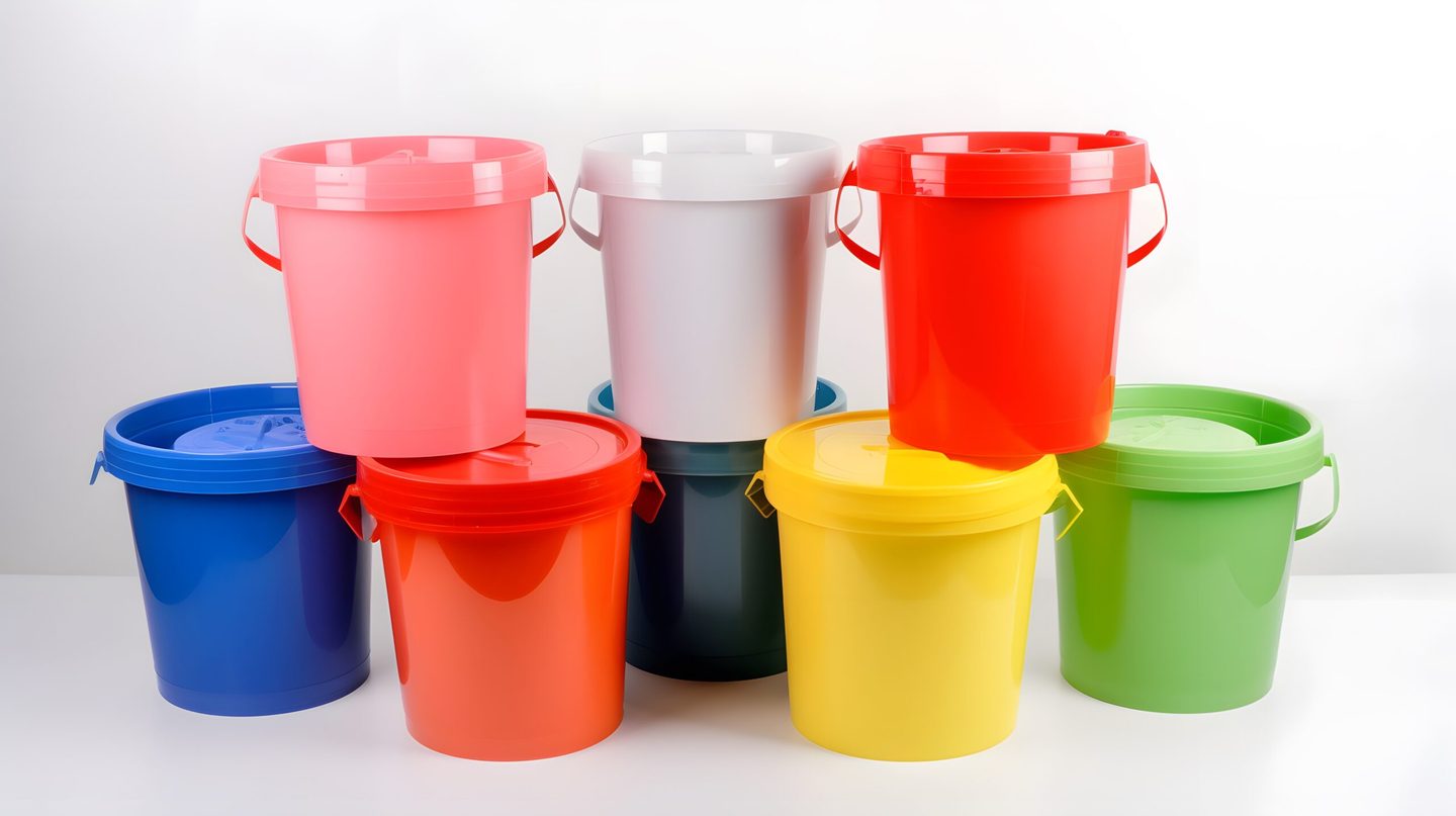
Wiadra na Żywnośćis a specialist online store offering a wide range of containers and buckets for storing food and other substances. The store serves both individual customers and businesses, including manufacturing companies and local government units. It's part of Easy-Commerce - a company we'd previously worked with on the Maluchy w Podróży and Do-garazu.pl projects.
The goal of the project was to rebuild the site to increase its functionality and appeal. The priority throughout the redesign was improving the user experience and streamlining the purchase path.
Project Goals
The previous version of the Wiadra na Żywność store didn't stand out visually or functionally. The homepage consisted of a few product modules, with no visual elements, promotional banners, or decorative graphics. From a UX standpoint, the store's navigation structure wasn't very intuitive, making it hard for customers to quickly find the right containers and buckets in the size, color, or category they needed.
We set ourselves the following main goals:
- Create a modern, interactive, and visually appealing version of the store,
- Improve the menu and navigation structure so customers can easily find exactly what they're looking for,
- Implement an intuitive bucket configurator to simplify the purchase process,
- Prepare dedicated pages for B2B customers and local government units,
- Improve the store's UX/UI to boost conversions and user convenience.
Old vs. New Store Comparison
| Element | Previous store version | New store version |
| Design and UI | Plain, visually unappealing | Modern, consistent with the brand |
| Homepage | A few bestsellers, no visual accents | Dynamic banners, product configurator |
| Navigation | No unified menu | Extensive, intuitive menu with product filtering |
| Purchase process | Customers had to click through many subpages | Bucket configurator - purchase in a few clicks |
| SEO | Low content volume and keyword range, limited optimization, low visibility | Full optimization, better indexing in Google, making the most of existing organic potential |
| B2B readiness | No dedicated pages for businesses | Special pages for business and government customers |
Store Design
As part of the redesign, we built a completely new brand image based on shades of green, symbolizing freshness and eco-friendliness - values that matter when it comes to food containers. We used visually striking graphics, dynamic banners, and consistent typography to give the site a modern, professional look.
We unified the navigation menu so customers can easily filter products by type, color, capacity, and other key parameters. This significantly streamlined the purchase process and cut down the time needed to find the right product.
Implementation
One of the key elements of the new store is the bucket configurator, built into the homepage. It lets users quickly select the type, color, capacity, and quantity of buckets they want to order - all in just a few clicks, without leaving the homepage. Once the product is configured, the user gets a final price and a link straight to the product, which they can add to their cart right away. This significantly shortens the decision-making process and improves user convenience, which translates into higher conversion. A built-in chat also supports the overall user experience.
We also developed dedicated pages for B2B customers and local government units. This industry often places recurring orders for food production and storage containers, so we prepared special pages that make it easy to establish long-term cooperation on preferential terms.
SEO and User Experience (UX) Optimization
The store was optimized for SEO - we made sure headings, meta tags, and content included the right keywords related to food containers. This gives the site better visibility in search engines and attracts more potential customers.
Responsiveness was a priority for us - the new version of the store is fully adapted for mobile devices, which matters more than ever as more users shop from smartphones and tablets.
Results
The new version of the Wiadra na Żywność store has improved the user experience and boosted conversions. Better navigation, an intuitive configurator, and a modern visual design mean customers now spend more time on the site and are more likely to make a purchase. The dedicated B2B and local-government pages opened up new business opportunities, and the SEO optimization improved visibility in search results.
You can see the results of our work at wiadranazywnosc.pl.
Like what you see? Get in touch with us by filling out the form below to learn more or start a collaboration!
Categories